
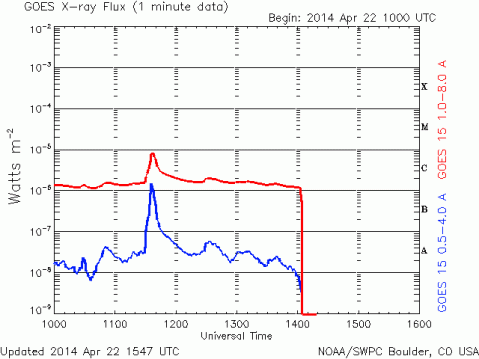
Strange!!! Sun X-Ray Flux takes a Nosedive – Image April 22, 2014
I’ve never seen this happen before!! The red line takes a nosedive, hits the bottom, then runs along the bottom line.

Current Solar Data http://www.n3kl.org/sun/noaa.html
SWPC Real-time Monitor Displays
http://www.swpc.noaa.gov/rt_plots/index.html
4 responses to “Strange!!! Sun X-Ray Flux takes a Nosedive – Image April 22, 2014”
Leave a reply to Salty Cancel reply
Hi There!


.

MY first post was at 9:10 AM PDT. Below is an image at 10:40 AM PDT. In the image below it looks like it went below the last line on the graph, then shot up to C. Links are in my post above.
.
X-Ray Flux 5 min data shows it hit bottom (or below) twice now. 11:45AM PDT.
It’s possible the data equipment experienced a glitch or did a scheduled rotation. I don’t know that for sure but want to propose that possibility because of a Dr. Keith Strong video I saw some time ago during which he explained that sort of thing. Also, I MAY have seen the solar X-ray graph look like that before.
.
Hi Polly,
Thanks. It’s weird so it probably is a glitch. I’m going to keep a eye on it until I find out for sure what’s going on.